BAKT
Personal Training
Logo Re-Design
Brand Identity
Brand Strategy
Persona Development
Brand Re-positioning & Messaging
Mood boards
Social Media Channel Re-brand
Sales Book Re-design
A rebranding project for a personal training service offering their clients physical fitness, mental fortitude, naked confidence and pain free living.
The client was after a new identity system that was aligned with their values and reflected their premium service, offering their clients more than physical fitness but mental fortitude, naked confidence and pain free living.
We started with a discovery session for an hour. We boiled down their unique proposition, provided clarity on their offering and finding their brand’s voice. We decided on essentials the business required that would fit both the budget and timeline that we had agreed on. To create a professional, high quality personal training service, offering more value to their customers while securing commitments which in turn secured finances. This is a common problem in the fitness industry, personal trainers often find it difficult for their customers to commit to their goals due to a variety of reasons which effects their finances.
As a brand BAKT now has
A consistent look and feel for their target market to connect with and understand.
For the owner it has given him peace of mind, confidence that his clients are wholly committed to their goal and has allowed him to effectively track his business's finances and plan his growth.
Just two weeks after completion the client has already secured 3 new clients who have committed themselves to the 12-week long engagement. Purchasing one of the top tier packages and the entry level packages with still more to come.
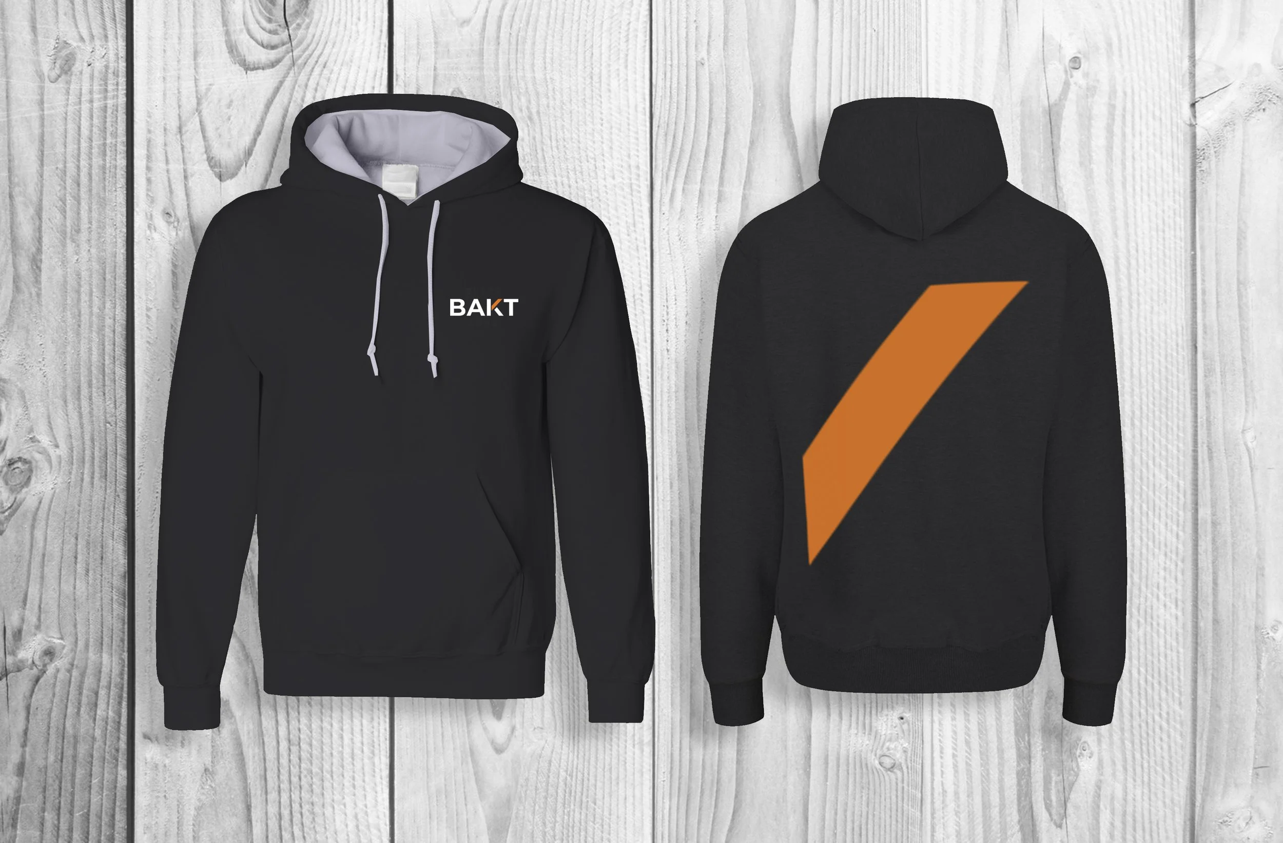
The orange element used in this logo symbolises the individual being uplifted and supported by BAKT. While the rest of the logo is black (or white in some cases), it emphasises the idea that BAKT provides a simple to follow and understand service. It reflects the connection to ancient wisdom of using natural products to optimize the body. The concept behind this design was to create a clean, minimal logo with an accent of colour that represents the support and passion BAKT provides.